您现在的位置是:网站首页> 编程资料编程资料
一款纯css3实现的圆形旋转分享按钮旋转角度可自己调整css3中transform属性实现的4种功能详解CSS3.0(Cascading Style Sheet) 层叠级联样式表纯CSS3实现div按照顺序出入效果CSS3实现列表无限滚动/轮播效果css3 利用transform-origin 实现圆点分布在大圆上布局及旋转特效CSS3实现的侧滑菜单CSS3实现的3D隧道效果用CSS3画一个爱心css3 实现文字闪烁效果的三种方式示例代码六种css3实现的边框过渡效果
 2021-09-06
1261人已围观
2021-09-06
1261人已围观
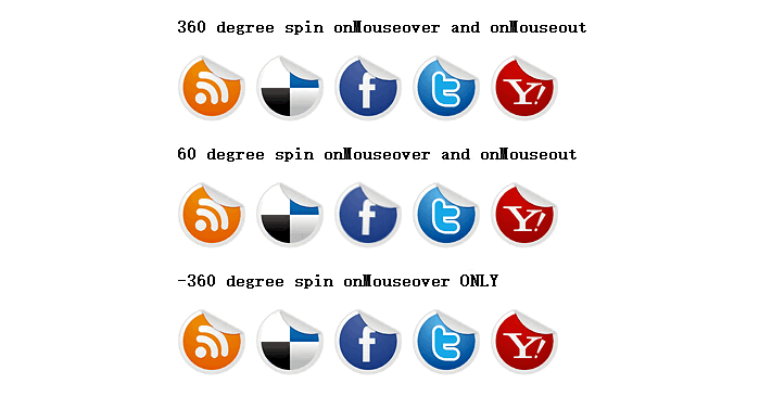
简介 一款纯css3实现的圆形旋转分享按钮。旋转的角度可以自己调整。在demo中演示了三个角度旋转。360度,60度,-360度,喜欢的朋友可以参考下
之前已经为大家介绍了好几款css3按钮,今天要为大家介绍的是一款纯css3实现的圆形旋转分享按钮。旋转的角度可以自己调整。在demo中演示了三个角度旋转。360度,60度,-360度。如图:
源码下载
看下实现代码:
html代码:
360 degree spin onMouseover and onMouseout
css代码:
p#socialicons img
{
/* 1st set of icons. Rotate them 360deg onmouseover and out */
-moz-transition: all 0.8s ease-in-out;
-webkit-transition: all 0.8s ease-in-out;
-o-transition: all 0.8s ease-in-out;
-ms-transition: all 0.8s ease-in-out;
transition: all 0.8s ease-in-out;
}
p#socialicons img:hover
{
-moz-transform: rotate(360deg);
-webkit-transform: rotate(360deg);
-o-transform: rotate(360deg);
-ms-transform: rotate(360deg);
transform: rotate(360deg);
}
p#socialicons2 img
{
/* 2nd set of icons. Rotate them 60deg onmouseover and out */
-moz-transition: all 0.2s ease-in-out;
-webkit-transition: all 0.2s ease-in-out;
-o-transition: all 0.2s ease-in-out;
-ms-transition: all 0.2s ease-in-out;
transition: all 0.2s ease-in-out;
}
p#socialicons2 img:hover
{
-moz-transform: rotate(70deg);
-webkit-transform: rotate(70deg);
-o-transform: rotate(70deg);
-ms-transform: rotate(70deg);
transform: rotate(70deg);
}
p#socialicons3 img
{
/* 3rd set of icons. Rotate them -360deg onmouseover ONLY. Note where the "transition prop is added */
}
p#socialicons3 img:hover
{
-moz-transition: all 0.5s ease-in-out;
-webkit-transition: all 0.5s ease-in-out;
-o-transition: all 0.5s ease-in-out;
-ms-transition: all 0.5s ease-in-out;
transition: all 0.5s ease-in-out;
-moz-transform: rotate(-360deg);
-webkit-transform: rotate(-360deg);
-o-transform: rotate(-360deg);
-ms-transform: rotate(-360deg);
transform: rotate(-360deg);
}

源码下载
看下实现代码:
html代码:
复制代码
代码如下:360 degree spin onMouseover and onMouseout


60 degree spin onMouseover and onMouseout
-360 degree spin onMouseover ONLY
css代码:
复制代码
代码如下:p#socialicons img
{
/* 1st set of icons. Rotate them 360deg onmouseover and out */
-moz-transition: all 0.8s ease-in-out;
-webkit-transition: all 0.8s ease-in-out;
-o-transition: all 0.8s ease-in-out;
-ms-transition: all 0.8s ease-in-out;
transition: all 0.8s ease-in-out;
}
p#socialicons img:hover
{
-moz-transform: rotate(360deg);
-webkit-transform: rotate(360deg);
-o-transform: rotate(360deg);
-ms-transform: rotate(360deg);
transform: rotate(360deg);
}
p#socialicons2 img
{
/* 2nd set of icons. Rotate them 60deg onmouseover and out */
-moz-transition: all 0.2s ease-in-out;
-webkit-transition: all 0.2s ease-in-out;
-o-transition: all 0.2s ease-in-out;
-ms-transition: all 0.2s ease-in-out;
transition: all 0.2s ease-in-out;
}
p#socialicons2 img:hover
{
-moz-transform: rotate(70deg);
-webkit-transform: rotate(70deg);
-o-transform: rotate(70deg);
-ms-transform: rotate(70deg);
transform: rotate(70deg);
}
p#socialicons3 img
{
/* 3rd set of icons. Rotate them -360deg onmouseover ONLY. Note where the "transition prop is added */
}
p#socialicons3 img:hover
{
-moz-transition: all 0.5s ease-in-out;
-webkit-transition: all 0.5s ease-in-out;
-o-transition: all 0.5s ease-in-out;
-ms-transition: all 0.5s ease-in-out;
transition: all 0.5s ease-in-out;
-moz-transform: rotate(-360deg);
-webkit-transform: rotate(-360deg);
-o-transform: rotate(-360deg);
-ms-transform: rotate(-360deg);
transform: rotate(-360deg);
}
相关内容
- 用纯css3实现的图片放大镜特效效果非常不错css3动画鼠标放上图片逐渐变大鼠标离开图片逐渐缩小效果基于CSS3实现鼠标滑过图片上移代码无需JS和jQuery代码实现CSS3鼠标浮动放大图片
- css 相对浏览器动态居中永远保持在屏幕正中CSS Transition通过改变Height实现展开收起元素从QQtabBar看css命名规范BEM的详细介绍css实现两栏布局,左侧固定宽,右侧自适应的多种方法CSS 实现Chrome标签栏的技巧CSS实现两列布局的N种方法CSS实现隐藏搜索框功能(动画正反向序列)CSS3中Animation实现简单的手指点击动画的示例详解CSS中的特指度和层叠问题详解overflow:hidden的作用(溢出隐藏、清除浮动、解决外边距塌陷)关于CSS浮动与取消浮动的问题
- CSS3 中的@keyframes介绍详解CSS动画属性关键帧keyframes全解析CSS3 @keyframes简单动画实现 CSS3中的@keyframes关键帧动画的选择器绑定@keyframes规则实现多重背景的CSS动画快速解决css使用@keyframes加载图片首次循环时出现白色间隙问题(闪屏)
- 纯CSS结合DIV实现的右侧底部简洁悬浮效果CSS鼠标悬浮DIV后显示DIV外的按钮解决方法采用CSS定位属性实现Html中DIV层叠与悬浮CSS实现的div悬浮框并且兼容IE6的样式纯CSS实现DIV悬浮的示例代码(固定位置)
- 浏览器如何判断css优先级CSS Transition通过改变Height实现展开收起元素从QQtabBar看css命名规范BEM的详细介绍css实现两栏布局,左侧固定宽,右侧自适应的多种方法CSS 实现Chrome标签栏的技巧CSS实现两列布局的N种方法CSS实现隐藏搜索框功能(动画正反向序列)CSS3中Animation实现简单的手指点击动画的示例详解CSS中的特指度和层叠问题详解overflow:hidden的作用(溢出隐藏、清除浮动、解决外边距塌陷)关于CSS浮动与取消浮动的问题
- 浅析CSS 属性之中经常出现的百分比CSS Transition通过改变Height实现展开收起元素从QQtabBar看css命名规范BEM的详细介绍css实现两栏布局,左侧固定宽,右侧自适应的多种方法CSS 实现Chrome标签栏的技巧CSS实现两列布局的N种方法CSS实现隐藏搜索框功能(动画正反向序列)CSS3中Animation实现简单的手指点击动画的示例详解CSS中的特指度和层叠问题详解overflow:hidden的作用(溢出隐藏、清除浮动、解决外边距塌陷)关于CSS浮动与取消浮动的问题
- css(html)背景图优化合并技巧详解CSS Transition通过改变Height实现展开收起元素从QQtabBar看css命名规范BEM的详细介绍css实现两栏布局,左侧固定宽,右侧自适应的多种方法CSS 实现Chrome标签栏的技巧CSS实现两列布局的N种方法CSS实现隐藏搜索框功能(动画正反向序列)CSS3中Animation实现简单的手指点击动画的示例详解CSS中的特指度和层叠问题详解overflow:hidden的作用(溢出隐藏、清除浮动、解决外边距塌陷)关于CSS浮动与取消浮动的问题
- css 串联选择器和后代选择器介绍及示例CSS Transition通过改变Height实现展开收起元素从QQtabBar看css命名规范BEM的详细介绍css实现两栏布局,左侧固定宽,右侧自适应的多种方法CSS 实现Chrome标签栏的技巧CSS实现两列布局的N种方法CSS实现隐藏搜索框功能(动画正反向序列)CSS3中Animation实现简单的手指点击动画的示例详解CSS中的特指度和层叠问题详解overflow:hidden的作用(溢出隐藏、清除浮动、解决外边距塌陷)关于CSS浮动与取消浮动的问题
- 纯CSS3发光分享按钮的实现教程css3中transform属性实现的4种功能详解CSS3.0(Cascading Style Sheet) 层叠级联样式表纯CSS3实现div按照顺序出入效果CSS3实现列表无限滚动/轮播效果css3 利用transform-origin 实现圆点分布在大圆上布局及旋转特效CSS3实现的侧滑菜单CSS3实现的3D隧道效果用CSS3画一个爱心css3 实现文字闪烁效果的三种方式示例代码六种css3实现的边框过渡效果
- css样式表中中文名字体乱码使用Unicode可解决WEB页面HTML分析工具 V1.1 绿色中文免费版 支持Unicode编码的各种html/有趣的Unicode CSS类命名方式-CSS教程-网页制作-网页教学网CSS 常用中文字体 Unicode 编码表